Pantone’s announcement of its Color of the Year is an event that inspires the celebration of the latest trends in design. Every year since 2000, a panel of experts meets in a European capital to select the shade that best represents the mood and spirit of the times. The selection process is a secret and Pantone only announces the hue twice a year. They gather “representatives from various nations’ color standards groups” to present and debate colors before deciding. In choosing a hue, the experts look at trends, cultural influences, and global happenings to decide what will be the hottest colors for the coming year.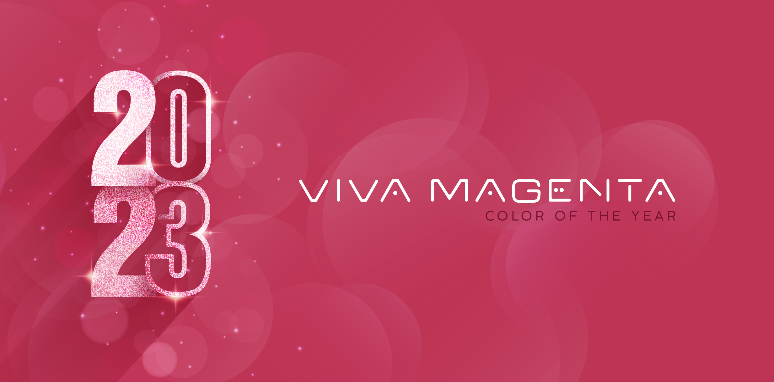
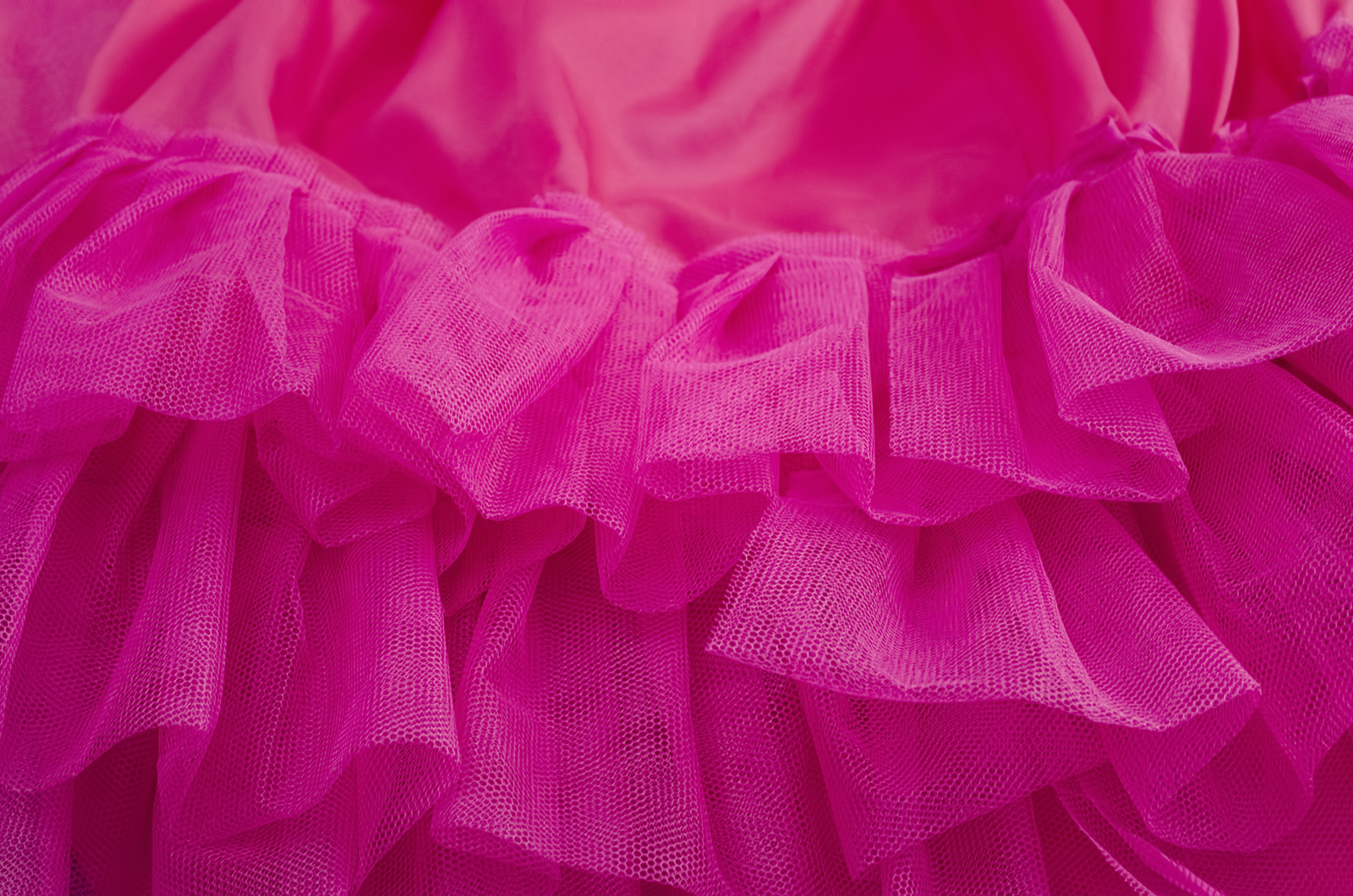
In 2023, the color of choice is Viva Magenta, which combines reddish-pink and yellow tones that are said to convey bravery, strength, and exuberance. According to the company, Viva Magenta is inspired by the red of cochineal, one of the most precious dyes in the natural dye family. It is also part of a broader Magenta Universe that includes other shades and complementary colors like pale and bright pinks, reds, and neutrals. Viva Magenta is a bold, fearless, and exuberant shade of color that’s ideal for apparel, accessories, and home decor. It encourages an optimistic celebration that writes a new narrative, according to Pantone.
 The colors that Pantone chooses have become a major event in the design world, and many people use these colors in their everyday lives. Graphic designers often incorporate them into their designs for branding, publications, or packaging. Fashion designers use them to create clothing and accessories that will showcase the chosen shade, while fabric designers create textured and printed fabrics for curtains, throw blankets, and more.
The Pantone Matching System was created in 1956 and was intended for use by graphic designers and printers, who had traditionally matched color swatches with inks on paper. This new system gave designers an objective measure to standardize their colors and made it easy to maintain their color schemes across a variety of mediums. But, in the era of web design and social media, color, tone, and hue standardization become of paramount importance. Color standardization allows digital design and marketing teams to ensure that their selected colors are consistent across all digital devices. This system of colors helps the designer to create a cohesive brand image across websites and various social media platforms.